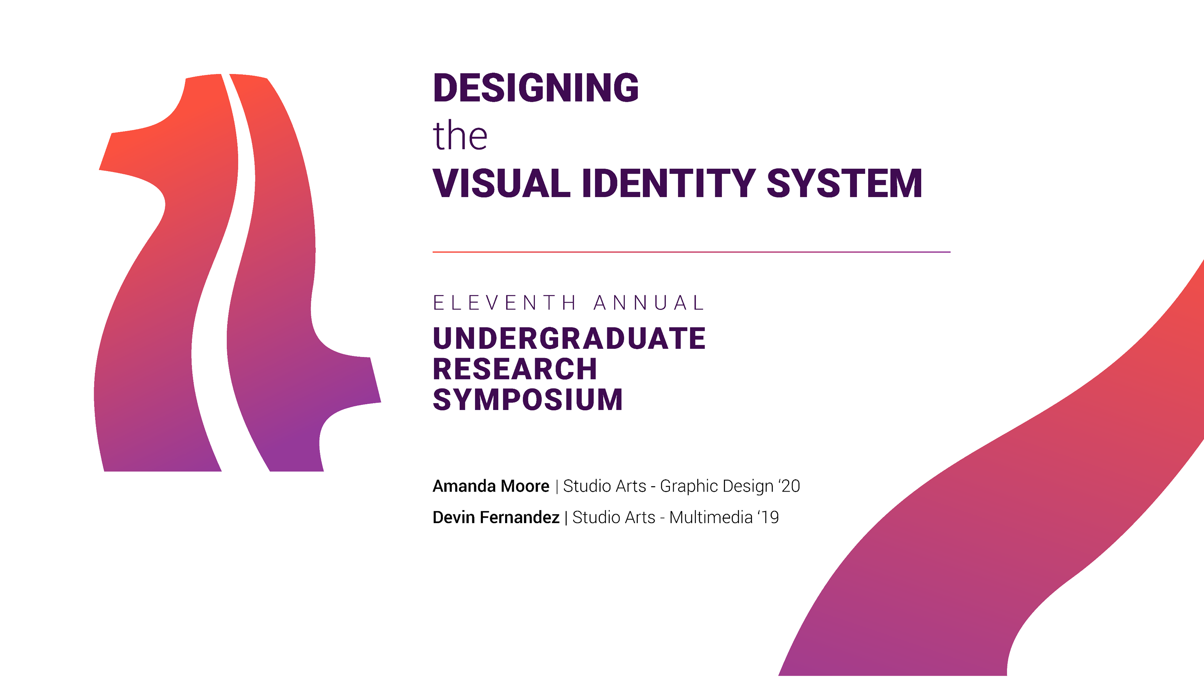
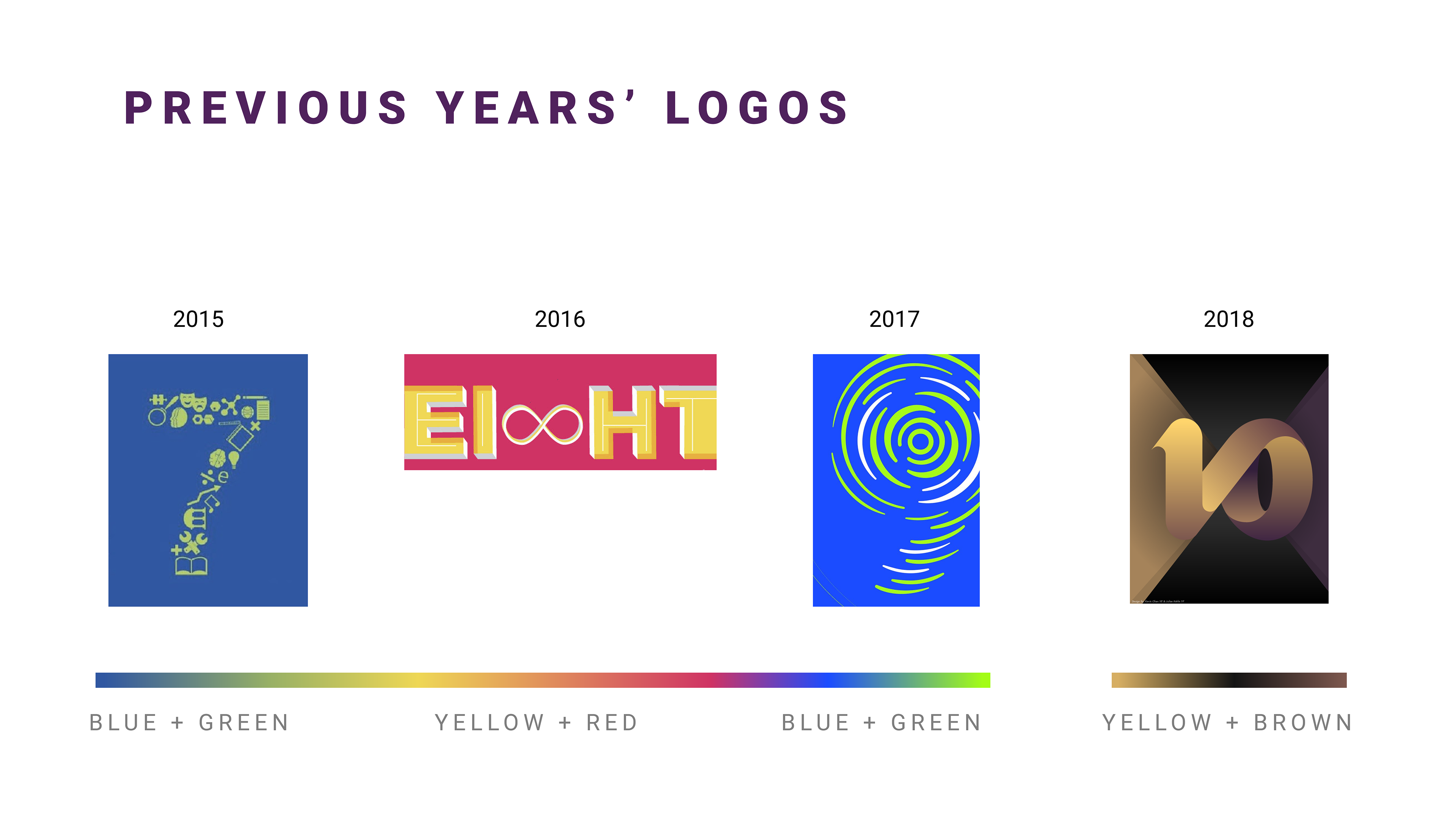
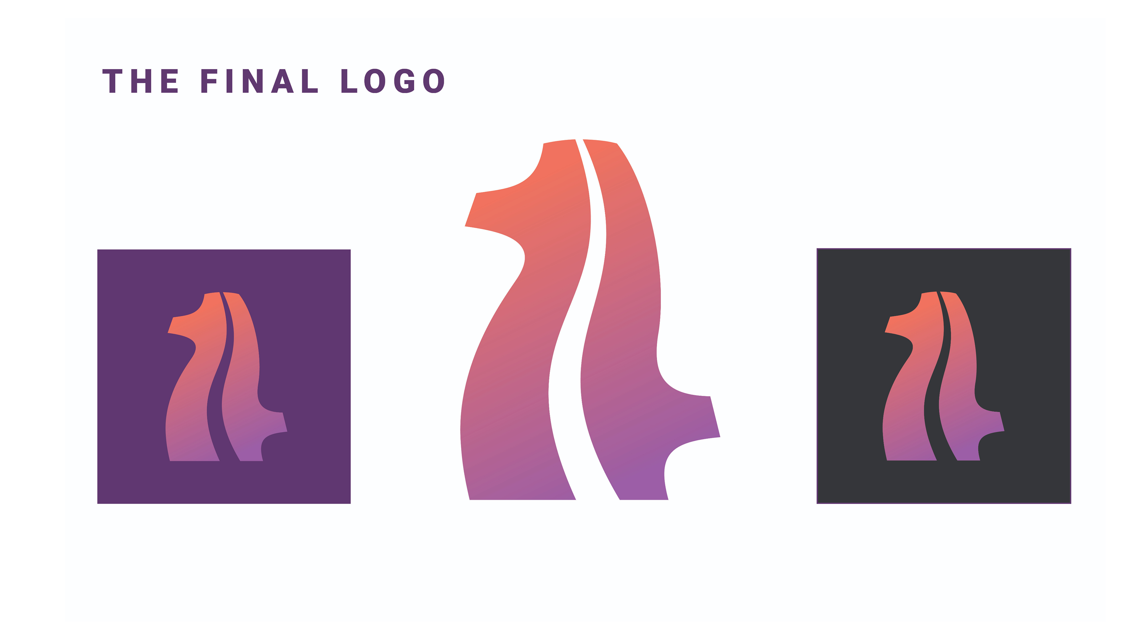
The previous years logos were very bright and flat. In 2018, the design team introduced a more 3D aesthetic and a darker color scheme. With our logo we wanted to create something that had a mix of all previous years.
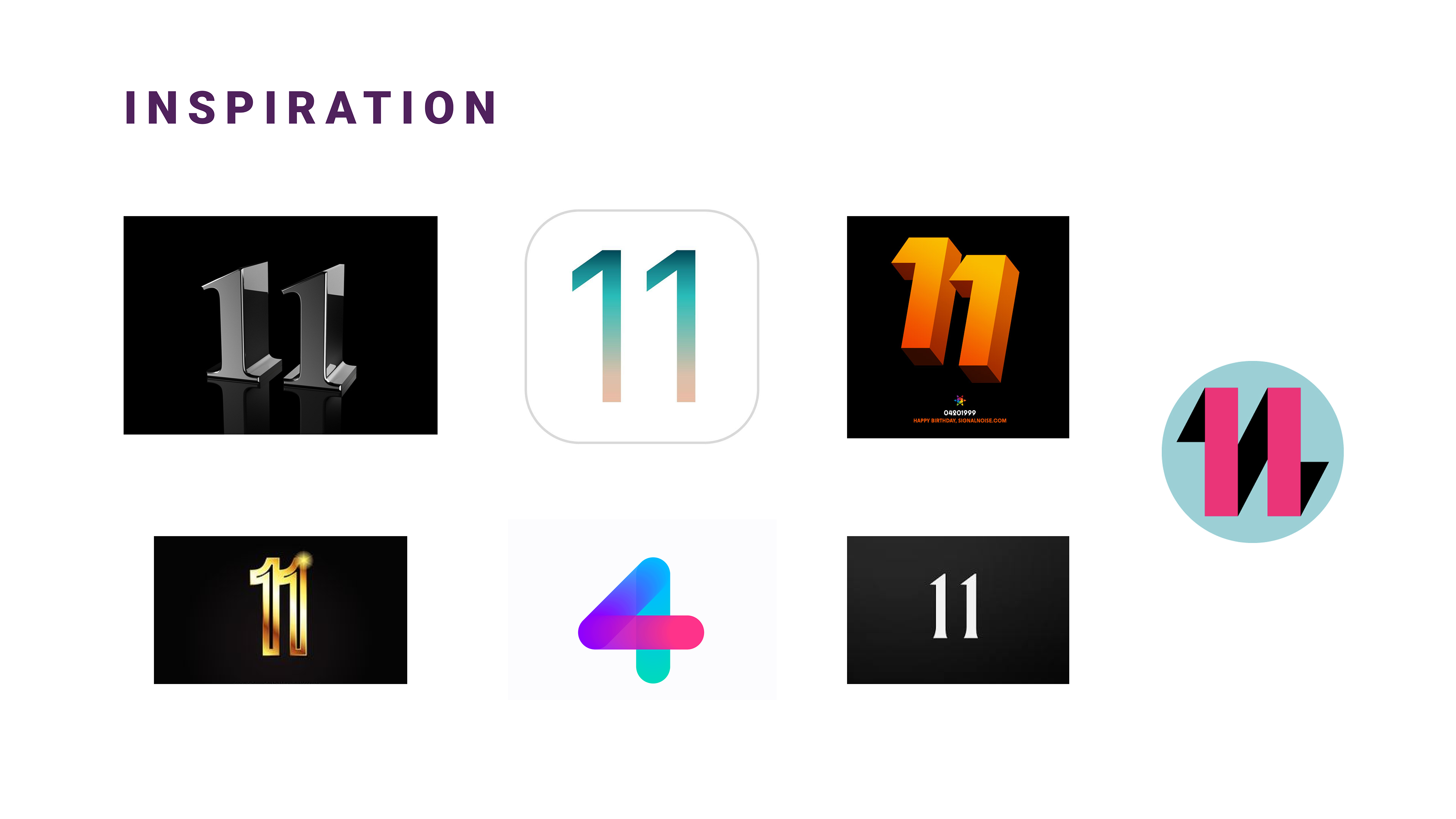
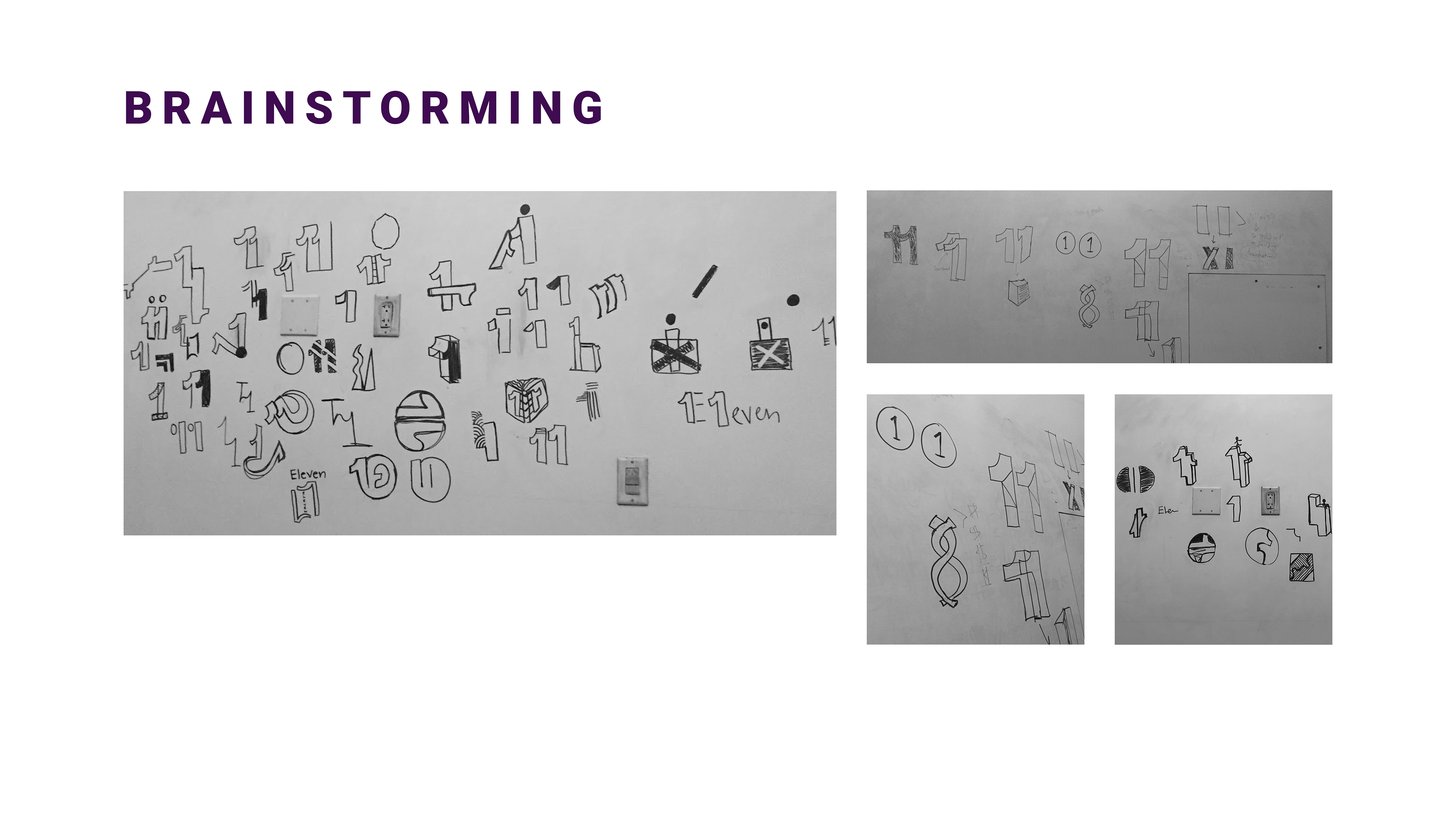
The inspiration really came from looking at past logos but also figuring out what trends to focus on. We knew gradients were a huge part of the design culture in 2018-19 so we decided to go with a gradient. We also liked the idea of flat design because it allowed our aesthetic to match with LMU's new rebrand as a university.
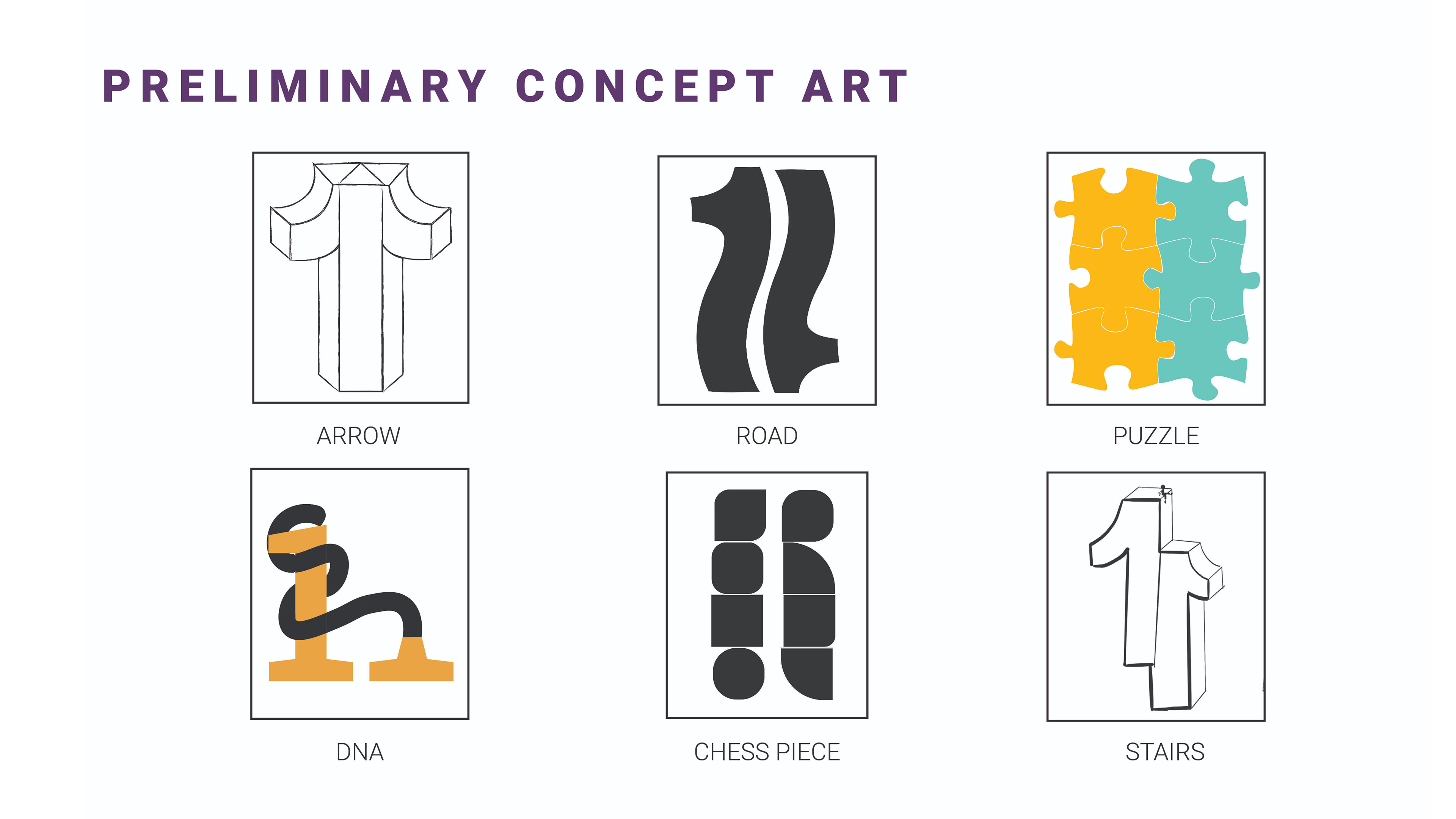
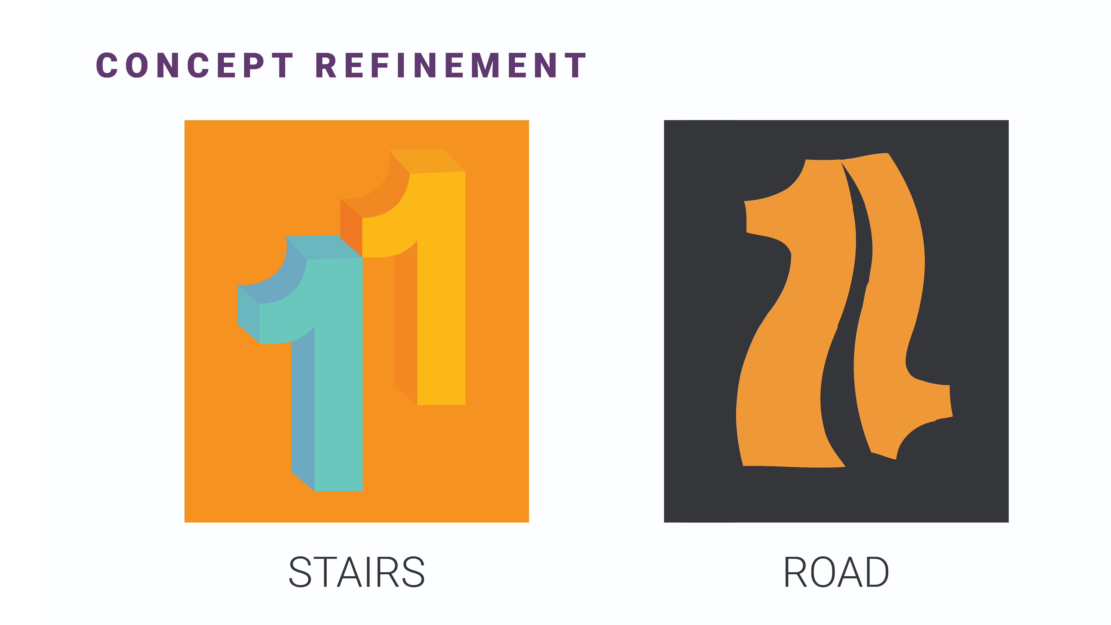
After ideating for a few weeks, we decided on these two. The road was my design and after a few adjustments, we made it the design for the 2019 symposium.
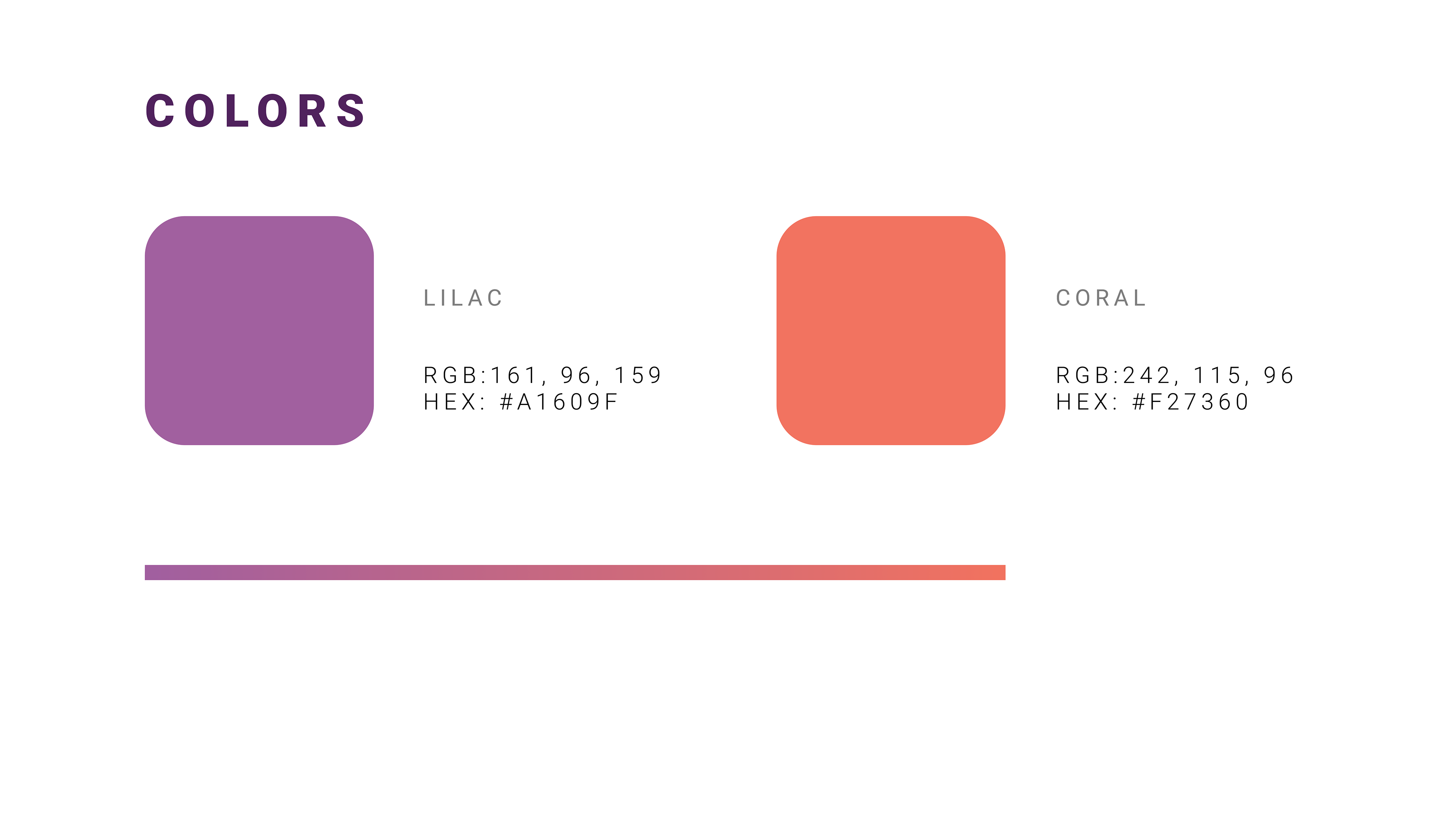
The colors we chose were inspired by the sunsets many southern Californian's enjoy every evening. LMU is situated on a bluff that overlooks Playa Vista so we found it fitting to include a color scheme that resembled the beauty of our university and it's surrounding landscape.
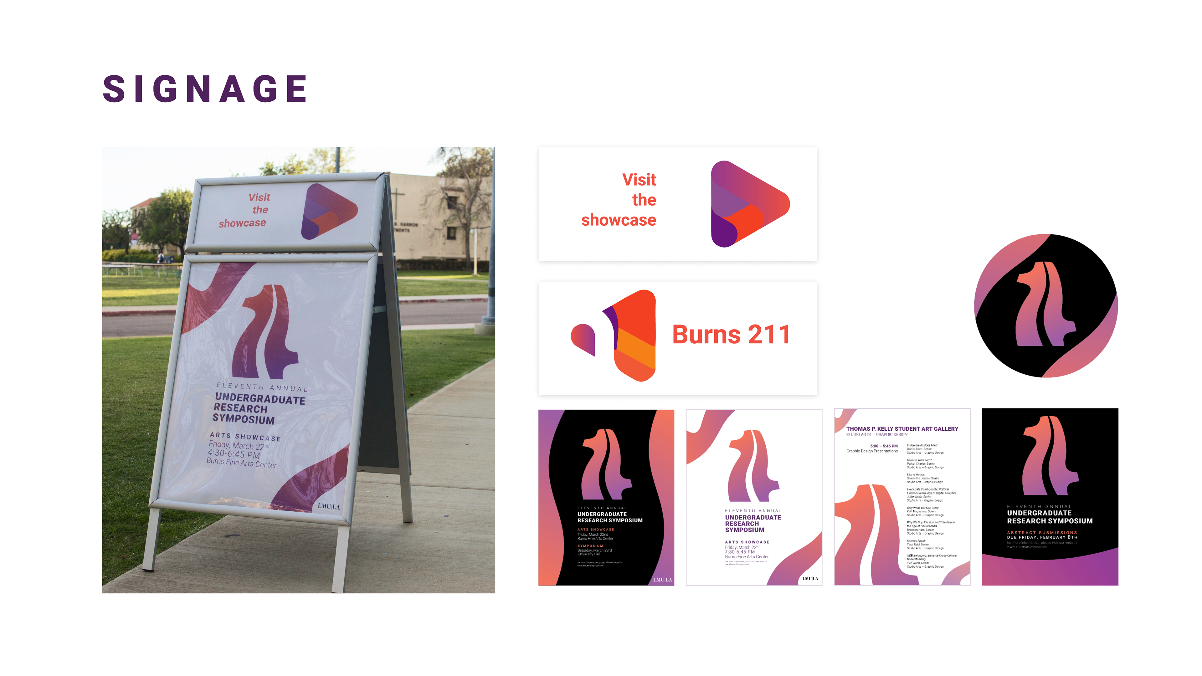
As for the signage, we wanted to maintain that organic flow you see on the logo throughout the entire marketing campaign.